Figures and Data from The Moral Case for Fossil Fuels
by Alex Epstein

This website is meant to provide high-resolution images from the figures in the book and -where possible- numerical data which makes it possible for the interested individual to recreate the figures.
We cannot provide data that has been obtained under commercial licenses or from sources that prohibit redistribution, but we provide links to online sources if available.

Figure 1.1: 80 Percent Increase in Worldwide Fossil Fuel Use 1980-2012 /
Figure 2.1: The Truth About Global Energy Use

The source provides data for consumption in million tonnes of oil equivalent (MTOE) for all individual energy sources and the total of primary energy consumption.The percentage values are shares of total primary energy consumption.
The scale is in quadrillion kilocalories. The conversion factor is 1 MTOE = 10,000,000,000,000 kcal.

Some differences to the book version are the result of rounding errors and data revision in the latest source data.

Figure 1.2: Fossil Fuel Use and Life Expectancy in China and India

The consumption values for coal, oil, and natural gas in million tonnes of oil equivalent (MTOE) have been added and converted in kcal, using the conversion factor 1 MTOE = 10,000,000,000,000 kcal.
The resulting annual values have been divided by the population number of each country for each year provided by World Bank. An additional division by 365 days for each year results in the unit of kilocalories per person per year.The life expectancy data for both countries can be used as is from the World Bank database.

Figure 1.3: Fossil Fuel Use and Income in China and India

The consumption values for coal, oil, and natural gas in million tonnes of oil equivalent (MTOE) have been added and converted in kcal, using the conversion factor 1 MTOE = 10,000,000,000,000 kcal.
The resulting annual values have been divided by the population number of each country for each year provided by world Bank. An additional division by 365 days for each year results in the unit of kilocalories per person per year.The income data for both countries are in constant 2005 dollars according to purchasing power parity (PPP) and can be used as is from the World Bank database.

Figure 1.4: More Oil Consumption, More Oil Reserves

The consumption values for oil in million tonnes of oil equivalent (MTOE) have been added and converted in kcal, using the conversion factor 1 MTOE = 10,000,000,000,000 kcal. The proved oil reserves are in billion barrels of oil and can be converted with the conversion factor 1 barrel of oil = 1,400,000 kcal.

Figure 1.5: More Natural Gas Consumption, More Natural Gas Reserves

The consumption values for natural gas in billion m³ converted to kcal, using the conversion factor 1 billion m³ NG = 9,000,000,000,000 kcal. The proved natural gas reserves are in trillion m³ and can be converted using the conversion factor 1 trillion m³ NG = 9,000,000,000,000,000 kcal.

Figure 1.6: U.S. Air Pollution Goes Down Despite Increasing Fossil Fuel Use
Figure 1.7: Decline in U.S. Air Pollution

The air pollution data can be used as is from the EPA data set.

Figure 1.7/6.1: More Fossil Fuels, More Clean Water

The consumption values for coal, oil, and natural gas in million tonnes of oil equivalent (MTOE) have been added and converted in kcal, using the conversion factor 1 MTOE = 10,000,000,000,000 kcal. The result has been divided by 365 and again by the total world population for each year.The data for access to improved water sources can be used as is from the World Bank data set.

Figure 1.8: Global Warming Since 1850-the Full Story

The ambient CO2 values can be used as is from the Scripps data set.The temperature anomalies are the global average derived from the HadCRUT4 grid measurements. The temperature data set has been expanded and revised since we used it and will show slightly different values for various data points.

Figure 1.9/5.1: More Fossil Fuels, Fewer Climate-Related Deaths

The CO2 emission data can be used as is from the CDIAC data sets. The same is true for the ice core and Mauna Loa CO2 data from the Scripps data set.The climate-related deaths can be obtained by querying the EM-DAT database for all climatological, hydrological, and meteorological disasters, sorted by year for the entire globe.Since publication of the book we decided that the disaster category of “complex disasters” included in the book version should not be considered as it covers disasters like famines that can, but do not necessarily, include climate-related causes. That results in some changes to annual values, including that of the previous record year of 1932 with 5 million deaths. The new record year is 1931 with over 3.7 million deaths.

Figure 2.2: Steel and Iron Required per Megawatt for Wind, Coal, and Natural Gas

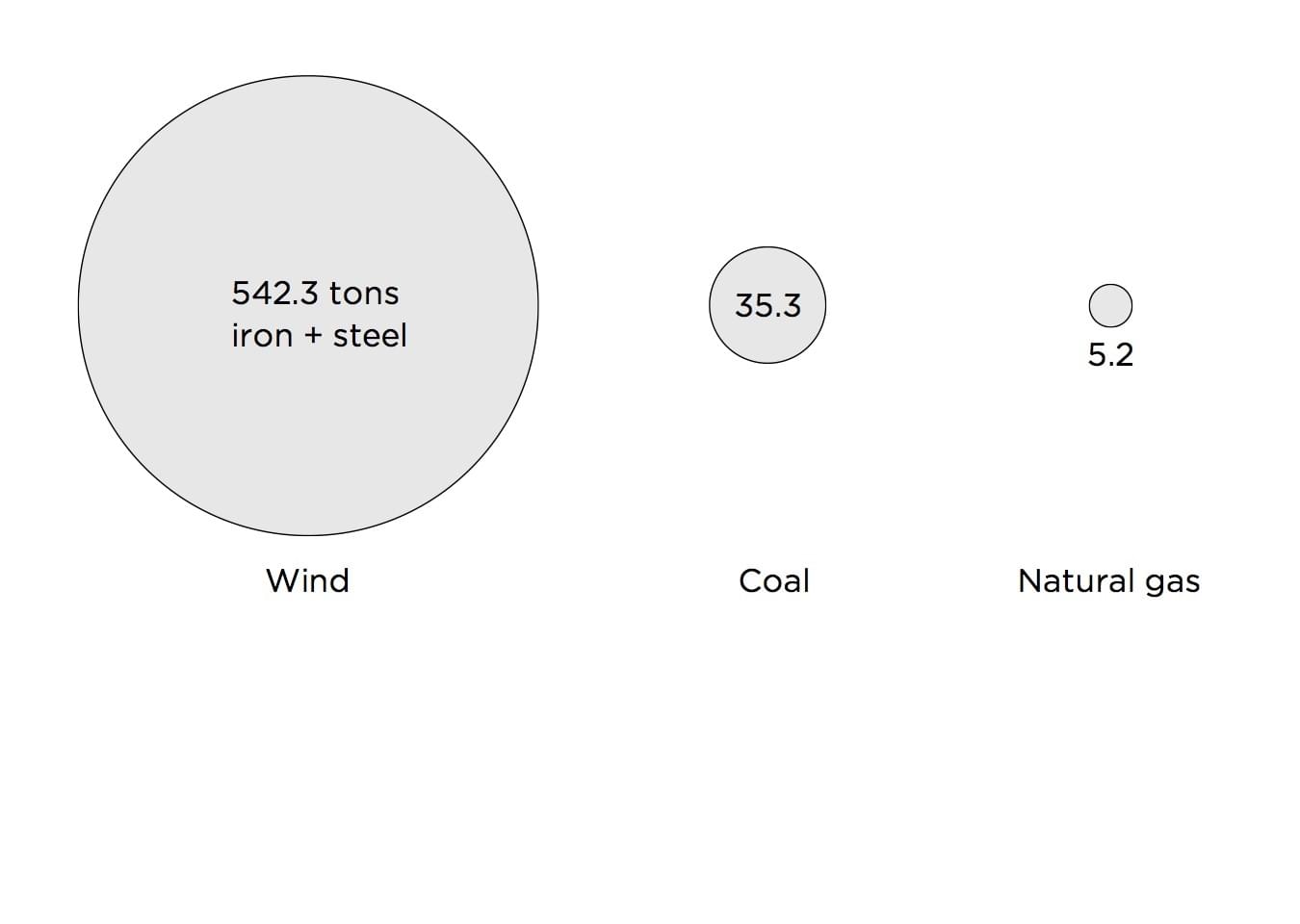
Mt = metric tonsNatural Gas 3.3 Mt (P/Z/P 2005, combined cycle) per 1 MW
Coal 41,000 Mt (Alpine Bau) per 1,600 MW (25.63 Mt per 1 MW

Wind 123 Mt (Wilburn 2011, Next generation onshore case) per 1 MW.


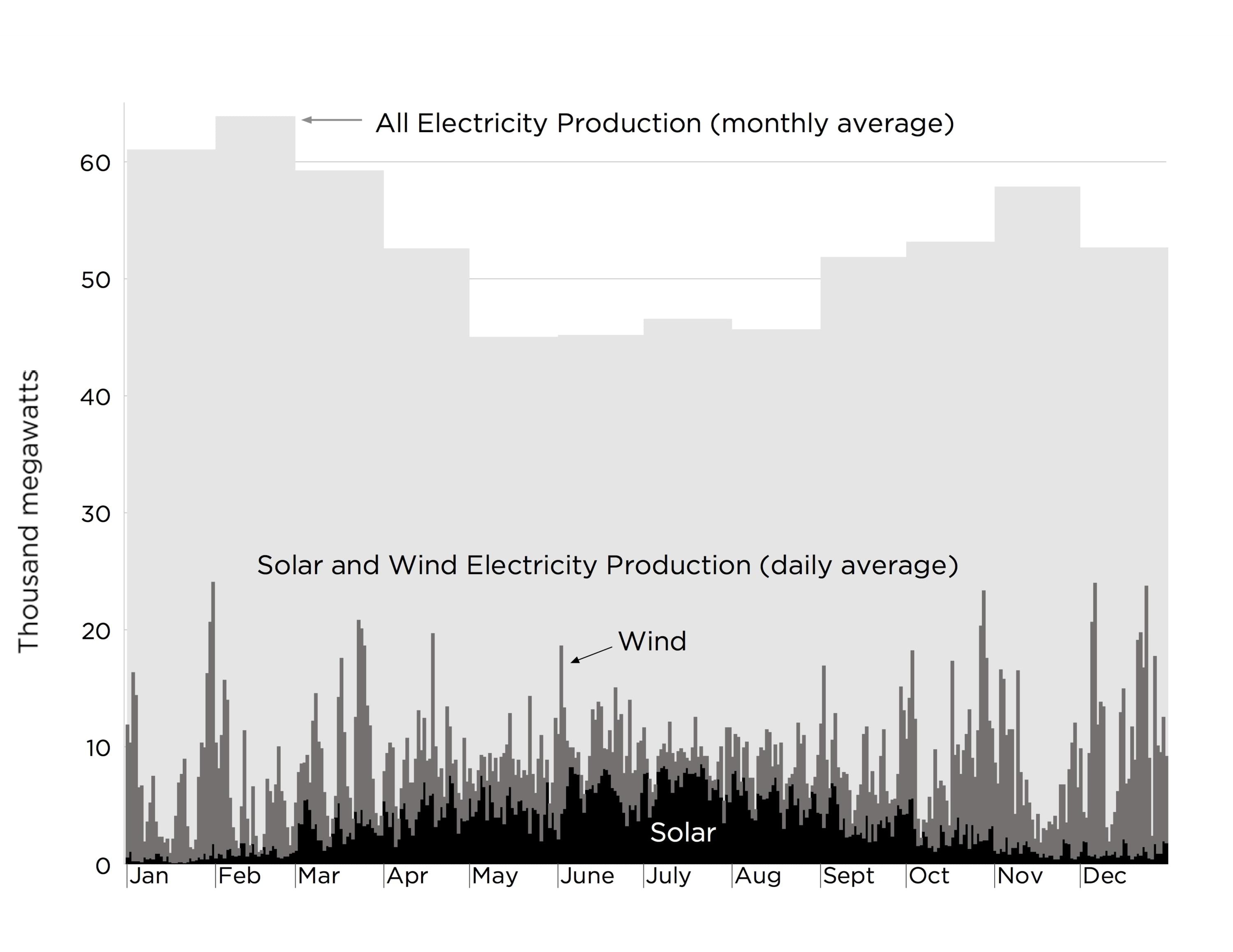
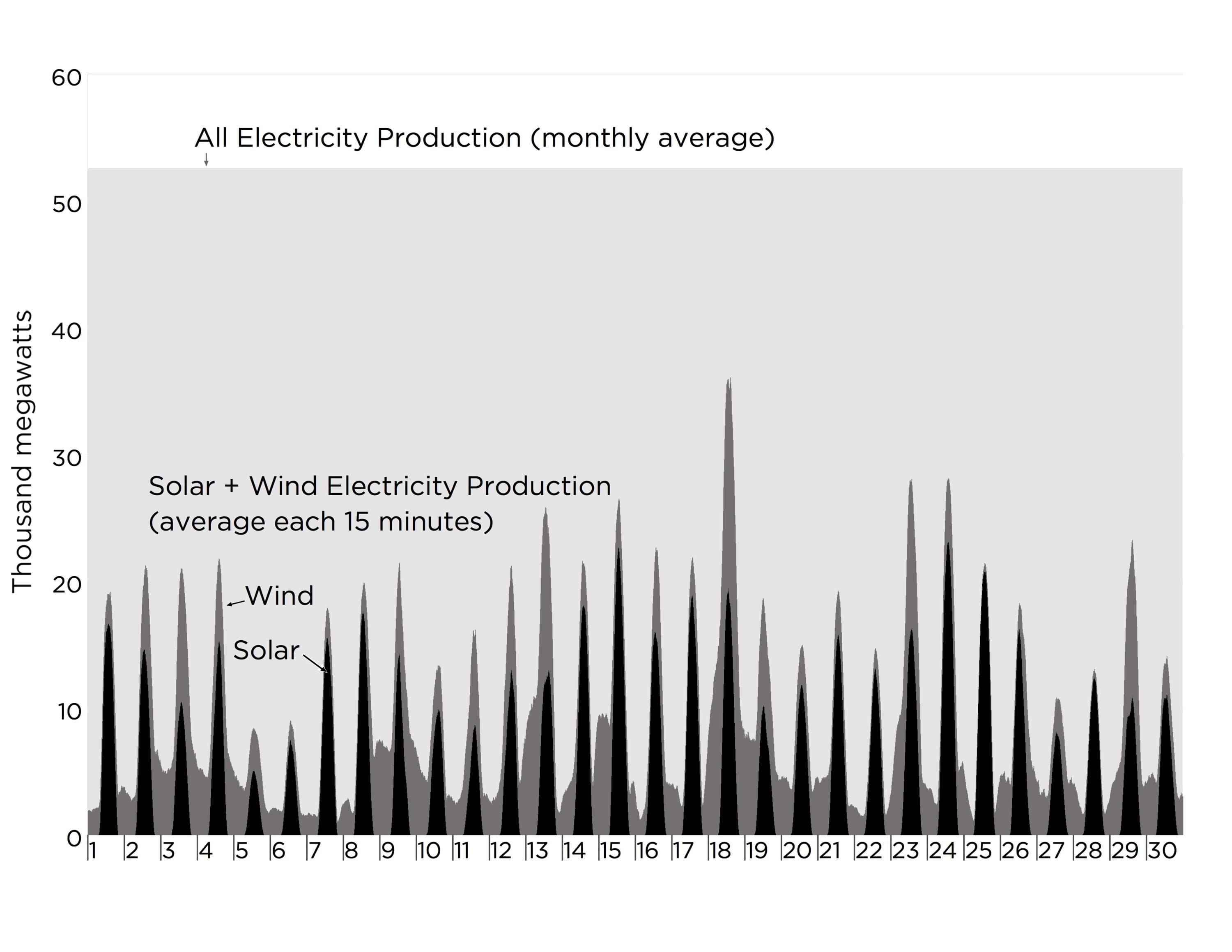
Capacity factors have been applied to correct for the varying actual production/potential production ratio of the different sources:
Wind = 123 Mt / 22% = 559 Mt
Coal = 25.63 Mt / 70% = 36.6 Mt
Natural Gas = 3.3 Mt / 60% = 5.5 Mt

Some differences in the values compared to the book version are the result of rounding errors during conversion of units. The conversion factors used are conservative estimates. Practical examples often show higher capacity factors for fossil fuel power plants and lower capacity factors for wind turbines, depending on the actual grid design. High volatile input capacity from solar and wind also arbitrarily forces the capacity factors of controllable energy sources to be lower than usual, as these have to absorb the volatility to ensure grid stability.
Sources: Alpine Bau GmbH website from July 2014 (Website is down due to insolvency of the hosting company)

Figure 2.3: Solar and Wind Provide a Small, Unreliable Fraction of Germany’s Electricity

The data has been obtained via a commercial license from EEX’s Transparency Platform. Daily example production data can be viewed on the EEX website for wind and solar.The monthly average power production in MW has been calculated from the monthly German electricity production data by dividing the value by the hours of each month.

Figure 2.4: Solar and Wind: The Closer You Look, the Less Reliable They Are

The data has been obtained via a commercial license from EEX’s Transparency Platform. Daily example production data can be viewed on the EEX website for wind and solar.The monthly average power production in MW has been calculated from the monthly German electricity production data by dividing the value by the hours of the month.

Figure 2.5: Comparison of Food Price Index to Biofuel Production

The data for biofuel production can be used as is from the BP data set.The website index mundi provides monthly data for the food price index, which can be averaged for annual values.

Figure 3.1: Fossil Fuel Use and Human Progress-the Big Picture

The data for CO2 emissions can be used as is from the CDIAC data set. For data before 1751 a flat emission curve was assumed, as the emissions and emission changes were trivial compared to modern times.For life expectancy a historic world average of 27 years was estimated from historical estimates, as well as a world average of 31 years for the year 1900. Linear interpolation has been used to fill data gaps until the year 1960. From 1960 to the present annual global average values can be used as is from World Bank. The result is an “edge” in the graph where historical estimates connect with modern data, but a significantly lower historic life expectancy, while possible, seems implausible. This should be considered a “good case” average, although volatility was probably high during that time period.
GDP per person and population values can be used as is from the Angus Maddison Project, which estimates historic data for both values. The population data after 1959 have been obtained from World Bank to include the most recent years. Slight discrepancies exist for overlapping time periods between the two data sets.

Figure 4.1: The Decelerating, Logarithmic Greenhouse Effect

The forcing function derived from Myhre et al. (1998) is ∆F = 5.35 * ln(C/C0).The preindustrial level of CO2 has been estimated as 280 ppm, the present levels is about 400ppm. These are considered lower troposphere world averages.

Figure 4.2: The NASA/Hansen Climate Model Prediction vs. Reality

The graph with scenarios from the NASA/Hansen model was mapped from the original figure in the Hansen et al. (1988) paper, which originally contained 3 scenarios, where scenario A was considered “business as usual” with increasing CO2 emissions similar to those observed aftert he prediction, and was supplemented with temperature anomaly measurements by NASA GISS GISTEMP Combined Land-Surface Air and Sea-Surface Water Temperature Anomalies (Land-Ocean Temperature Index, LOTI) data set.The RSS and HadCRUT4 data reference in the book version are incorrect. The NASA GISS measurements are also incorrectly labeled as “Hansen actual measurements,” although Dr. Hansen was involved in the scientific basics of building this GISS data set.

Figure 4.3: Climate Prediction Models That Can’t Predict Climate

 Image courtesy of Dr. John Christy of the University of Alabama at Huntsville. The various model outputs and satellite as well as balloon data can be obtained via the KNMI climate explorer tool.
Source:Dr. John Christy.

Figure 4.4: Storm Energy Is Normal

The monthly data values have to be aggregate over all ocean basins to calculate the global accumulated cyclone energy (ACC).Differences in appearance of graphs are typically the results of annual aggregation and smoothing of data by using running sums.

Figure 4.5: What Sea Level Rise Actually Looks Like

Data can be used as is for individual stations from the Permanent Service for Mean Sea Level.The U.S. National Oceanographic and Atmospheric Administration
(NOAA) also has a good overview of stations.

Figure 4.6: More CO2, More Plant Growth

Photography courtesy of Dr. Craig Idso from the Center for the Study of Carbon Dioxide and Global Change.
Source:Dr. Craig Idso

Figure 4.7: More CO2, More Crop Growth

The table is an excerpt of the plant growth database at the Center for the Study of Carbon Dioxide and Global Change.

Figure 5.2: More Fossil Fuel Use, Fewer Drought-Related Deaths

CO2 emission data from CDIAC can be used as is.Drought disasters are a subcategory of climatological disasters in the EM-DAT disaster database. The annual values have to be divided bye the values for world population of the same years, obtained by World Bank, to represent death rates from drought.

Figure 5.3: More Fossil Fuel Use, Fewer Storm-Related Deaths

CO2 emission data from CDIAC can be used as is.Storm disasters are a subcategory of meteorological disasters in the EM-DAT disaster database. The annual values have to be divided bye the values for world population of the same years, obtained by World Bank, to represent death rates from drought.

Figure 5.4: More Fossil Fuel Use, Fewer Flood-Related Deaths

CO2 emission data from CDIAC can be used as is.Flood disasters are a subcategory of hydrological disasters in the EM-DAT disaster database. The annual values have to be divided bye the values for world population of the same years, obtained by World Bank, to represent death rates from floods.

Figure 5.5: More Development, Less Climate Danger

CO2 emission data from CDIAC can be used as is.Climate-related deaths have been categorized as all deaths from climatological, hydrological, and meteorological disasters. To calculate a death rate for G7 countries, the total population of Canada, France, Germany, Italy, Japan, United Kingdom, and United States have to be aggregated for each year from World Bank data. The climate-related deaths of these countries are also aggregated and divided by the G7 population number to calculate a deaths rate for all G7 nations.
For a world death rate the climate-related deaths have to be divided by the world population number of each year from World Bank.

Figure 6.2: More Fossil Fuel Use, Less Tuberculosis

The consumption values for coal, oil, and natural gas in million tonnes of oil equivalent (MTOE) have been added and converted in kcal, using the conversion factor 1 MTOE = 10,000,000,000,000 kcal. The result has been divided by 365 and again by the total world population from World Bank data for each year.The data for tuberculosis incident rate per 100,000 persons can be used as is from the World Bank data set.

Figure 6.3: More Fossil Fuel Use, More Access to Sanitation

The consumption values for coal, oil, and natural gas in million tonnes of oil equivalent (MTOE) have been added and converted in kcal, using the conversion factor 1 MTOE = 10,000,000,000,000 kcal. The result has been divided by 365 and again by the total world population from world Bank data for each year.The data for access to improved sanitation facilities can be used as is from the World Bank data set.

Figure 7.2: Health Trends Improving Across The Board and Around the World

The data for infant mortality, mortality of children under 5, malnutrition prevalence, and life expectancy at birth can be used as is from the World Bank data set.